Admit it.
You’re jealous.
You see the blogs of your online heroes and they all seem to have something you don’t.
It’s right there at the top of the site and it’s practically taunting you.
A fancy, artsy, graphical logo.
Tiny Buddha has one. KISSMetrics has one. SmartPassiveIncome has one.
And you want one too.
After all, it’s not much fun being a wallflower online.
Nobody wants to be boring. Unremarkable is practically a capital crime.
You want to stand out, be noticed. You want to show people you mean business.
And a fancy schmancy logo is the way to do it. Right?
Why Logo Envy is a Deadly Distraction for Bloggers
On the surface, having a fancy logo when you start your blog seems like a smart idea.
You want to grab your reader’s attention the moment they land on your blog, and a striking graphical logo is a great way to do just that.
But if your blog is still in the early-growth stage, focusing on a logo can become a huge distraction.
It can send you down a design “rabbit hole” that will waste a tremendous amount of your time and money – especially in the early days, when you’re still refining exactly who you’ll write for, and what topics you’ll cover.
You could pay a designer hundreds of dollars to develop something only to discard it because it no longer reflects the focus of your blog.
And crucially, it distracts you from writing great content for your blog and from connecting with other bloggers – both of which will fuel your growth.
So for most bloggers, a fancy logo is the last thing they need.
That said, let’s get something obvious out of the way:
Never take a standard blog theme, install it on your site, and leave it as is.
If you do that, your blog will look identical to the blogs owned by everyone else who bought that same theme.
Hardly what you’d call attention-grabbing.
So the instinct to create a distinctive visual brand is a good one. We just need to channel that energy in the right direction.
But before we do, let’s make sure we’re all on the same page by talking a little logo lingo.
How Well Do You Know Your Logo Types?
Graphical logos are what you and I think of first when someone says the word “logo.” They’re the:
- Mermaid on the Starbucks cup
- Golden arches of McDonalds
- Apple with a bite out of it on Apple products

But some of the largest businesses and most-popular websites in the world use another type of logo.
It’s the wordmark logo, and it uses the name of the brand as the foundation for the logo. You’ve seen this when you visit the following sites:
- Yahoo!
- Business Insider
- Copyblogger

If your blog name has a power word in it (e.g. Business Insider, Yahoo!), Wordmark logos are especially effective.
They are relatively easy to create, too, even if you’re not a designer.
And because many blogs change their focus over the years as they build and get to know their audiences, a wordmark logo won’t saddle you with a distracting, expensive symbol that soon becomes outdated.
So if you think you want a fancy logo for your blog, a wordmark logo is what you need instead.
The Ingredients of a Successful Wordmark Logo
Before you set out to create your own wordmark logo, let’s review what makes a good one.
A successful wordmark logo design does the following:
- It is readable and clear, even when reduced down to a small size.
- The font choice and colors say something about the kind of visitor you want to attract (more on this later).
- It’s just quirky and unique enough to be memorable.
Want to peek at some successful wordmark logos? I’ve created a collection on a Pinterest board.
I’ll add to the board over time, so follow it if you’d like ongoing inspiration.
How to Create Your Own Wordmark Logo in 3 Easy Steps
Use the following steps to create a distinctive wordmark logo for your blog without large investments of time and money.
1. Decide who you want to attract
Before you tackle any kind of design project, take a step back and think hard about your ideal reader.
If your blog is up and running, hopefully you’ll have gone through a process like this at the beginning.
But if you didn’t, or you need a refresher, the basic steps are as follows:
- Identify who you want to reach by their basic demographic information: their gender, age range, income, education level. If you don’t know, make an educated guess about who you want to attract.
- Think about what this group needs. What is their day-to-day life like, and what are their challenges?
- Uncover what companies or brands your ideal reader currently admires and trusts. Who do they look up to? And why? This will give you inspiration for the wordmark you create.
When you know this information about your ideal reader, creating a visual brand that they can relate to will be much easier. You’ll understand their needs, and know how to communicate your solution to them.
For example, a younger demographic group reading a technology blog might expect a sans-serif font (similar to Helvetica) and bright, “young” colors.
An older group reading an investment blog might expect a serif font (similar to Georgia) and “corporate” colors like dark blue and green.
2. Choose a font to match your blog’s personality
When your logo is a wordmark, the font choice is crucial. It’s the visual element that will most clearly communicate your brand personality.
(Don’t know your brand personality? Take the brand personality quiz here.)
Your brand personality expresses what your blog or business represents, and humanizes your brand by assigning it personality traits.
When you understand both who you want to attract, and what kind of personality you want to express, your font choice is easier.
And when reviewing the thousands of available free fonts on sites like FontSquirrel.com and Google Fonts, keep the following characteristics in mind:
- Aim for readability first. Your wordmark must be easy-to-read when reduced in size, or used as a watermark on an image.
- Avoid the usual suspects. Stay away from the standard fonts you have on your computer: Times Roman, Helvetica, Georgia, Verdana, Trebuchet, and the rest. These don’t have enough personality to lend to your brand.
- Try your blog name using different fonts. Happy coincidences occur when you use the font viewing capabilities: you’ll discover how specific letters in your blog name are especially interesting in some fonts over others. This will help you decide which ones to try in a wordmark logo.
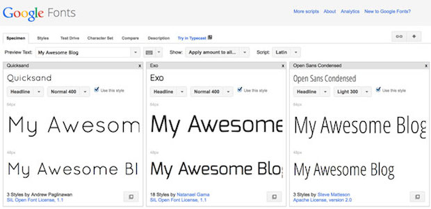
Google allows you to examine and compare different fonts so you can decide which one to use for your wordmark.
As you find fonts you’d like to consider for your logo, click Add to Collection next to the font. At the top of the screen, choose Word and type in the name of your blog (or whatever you want your wordmark to say).
Then, back on the bottom, click Review. You’ll see all the fonts you chose, lined up next to each other so you can compare them easily.
3. Set the type … carefully
Here’s the final and most-important step: set your type.
You could easily gloss over this step, but don’t because it’s important. Many fonts are drawn to look great at body text sizes, but when you enlarge them to the size you’ll use for your wordmark logo, the letter spacing will be off.
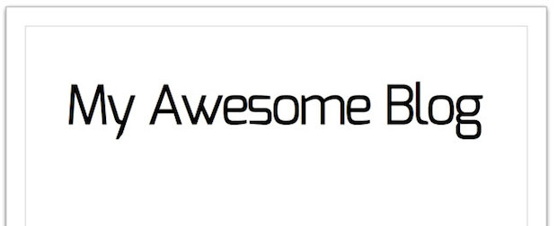
The effect you want to aim for is a group of cozy letters that are standing close together for a family photo, like this:
To accomplish this, you’ll need software that will allow you to adjust letter spacing. If you use any of the Adobe Creative Suite products like Photoshop, Illustrator, or InDesign, this is baked into the software.
But you don’t need $700 software to create a wordmark. You can use OpenOffice Draw to create a wordmark with nice, tight letter spacing.
You’ll need to download and install the fonts you want to try on your computer.
Then grab your free copy of the OpenOffice suite here.
Once inside OpenOffice Draw, type the name of your blog, and apply your custom font. Make it nice and large – at least 80 points.
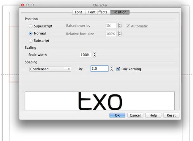
Now, adjust letter spacing. Click F11, or go to Format > Character. Under the Position tab, look for Spacing. In the drop down menu, select Condensed.
Choose the amount you want to condense the overall letter spacing by: start with 2.0. Make sure Pair Kerning is selected – this will tighten the space between letters that need it.
If certain letters are still too far apart, you can select them separately and apply a higher condensed spacing number.
Bonus Step: Give Your Logo a Twist
If you’ve followed the steps above, you have a nice-looking wordmark already. If you want to give it a little extra pop, try one of the following techniques:
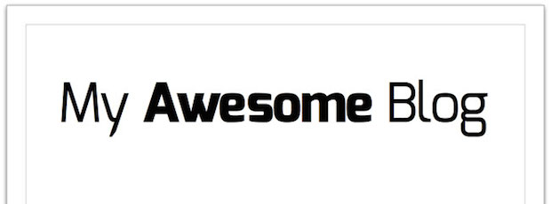
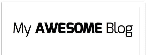
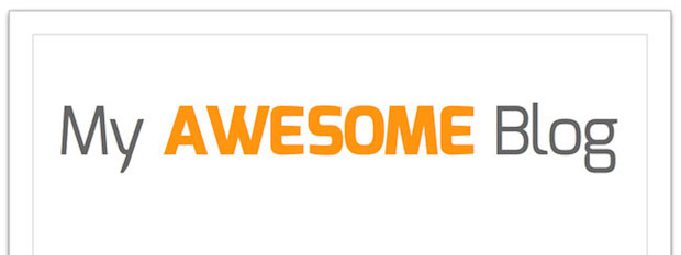
Bold one of the words. If you choose a typeface with a variety of weights, you can use some words in a lighter weight, and some bolder.
Feature one word in ALL CAPS. Choose the most important word and change it to all capital letters to make it memorable.
Apply color – sparingly. Add a pop of color to the most important word, and apply a neutral color such as grey to the other words. If you’ve chosen brand colors, choose one or two to put to use here.
These extra “twists” to customize your wordmark make it recognizable and easier to remember.
Export and make it live! From here, you’ll want to export it to either a .gif, .jpg, or .png format and upload it to the header area of your theme.
In OpenOffice, you’ll do this by going to File > Export. Next go to File Type, and choose one of the following file formats:
- GIF is good for images that have just a couple of colors and no gradations. In other words, flat images. The GIF format supports transparency, so if you need to place your wordmark logo over a colored background, it’s a good format to choose.
- JPEG is good for images that have gradations. This includes any art that includes photos.
- PNG is good for images that have gradations and need to be transparent.
Experiment with the different formats until you find one that gives the best-looking result for the smallest file size. Fast-loading images help your site’s speed, and that’s a big plus.
Make Your Blog a World-Class Brand with a Wordmark Logo
You don’t need to dive into a design rabbit hole in pursuit of a fancy logo.
And you don’t need to waste time and money on a design you might soon outgrow.
A well-crafted wordmark logo – in combination with savvy color and font choices – can make the difference between a blog that looks blah and one that looks polished, professional, and branded.
With this simple step-by-step formula and a few free tools, you can create your own wordmark logo to rival some of the world’s biggest brands.
Of course, this means you no longer have an excuse for a boring, vanilla-flavored blog.
A professional, attention-grabbing logo is within your reach.
So what are you waiting for? Dive in and start creating a brand that creates an impression and even adds profit to your blog!
