The landing page…
You’ve likely heard of it, and I’ll bet you my last dollar you’ve interacted with one.
Yet, why are they vital to your digital marketing campaign? Heck, what are they?
And how do you even create a landing page?
Don’t worry…
Our post will cover this and more. Ranging from the best landing page types to consider through to the key ingredients to create a powerful page.
Are you ready?
Let’s jump in!

What is a Landing Page?
A landing page is a standalone web page situated on your website. Its purpose is to house potential customers who have clicked through via a link from a digital channel.
Essentially it’s a page designed and optimized to capture a reader’s information in exchange for a service.
For example:
You’re browsing social media, and your curiosity leads you to click a link like this one from Sprout Social’s Twitter account:
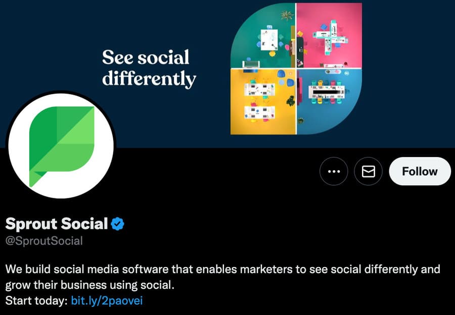
Once you click the link next to “Start today,” you “land” on:
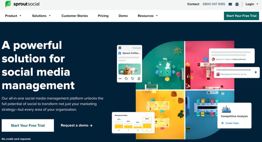
This is an example of a landing page. In particular, a click through landing page (more on this later).
Sprout Social’s goal is to gain a lead via a free trial to their social media management platform.
So, they’ve optimized their page to do just that and lead you to click the call to action (CTA):
“Start Your Free Trial”
You click, add your contact details, and use their services for free.
They gain a lead, and you gain a free service.
Win, win.
Why is a Landing Page Important?
So, you understand what a landing page is, but why are they essential? Why not just use your homepage on your website?
You could…
But a landing page targets a specific audience and is optimized to convert, whereas your website is designed for exploration and information.
With that in mind, a landing page benefits from:
- Measurability: with a single page you can easily track your conversions, bounce rates and other key metrics.
- Flexibility: a landing page allows you to quickly and effortlessly ab test elements on your page.
- Increased conversion rates: the average lead generation landing page conversion rate is 4.02%.
Only 4.02%?!?
Yep.
But the keyword is “average.”
Take a look at this table from Unbounce:
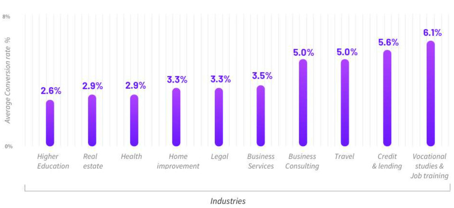
Higher education props up the rest at 2.6%, whereas vocational studies and job training lead the pack with 6.1%.
So with all this juicy information in mind, what types of landing pages should you focus on?
7 Top Landing Page Types That’ll Enhance Your Leads
There are many different types of landing pages to consider, and it’s challenging to track them all.
So, my advice is…
Don’t.
Keep it simple and focus on the best types of landing pages that’ll drive conversions and smash your digital marketing goals.
1. The Squeeze Page
Perhaps the most common landing page design is the squeeze page. Its purpose is to capture a lead by simply asking for your email address in exchange for gated content. Such as an:
- Ebook
- Template
- Newsletter
- Webinar
- Whitepaper
- Cheat sheet
- Check-list
Basically, anything that provides value to your target audience.
A squeeze page can be a standalone page or a simple pop-up. Take a look at this landing page example from Smart Blogger:
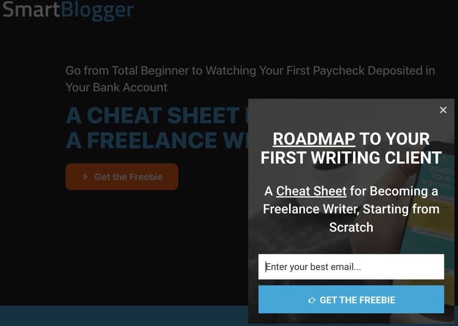
Once you land on the website, you’re greeted with a short and sharp CTA:
“Get the Freebie.”
If curiosity gets the better of you and your a sucker for a freebie (like me), you’ll likely click the link. Once you do, you’ll be presented with the above pop-up squeeze page offering a free cheat sheet for becoming a freelance writer.
Notice the simplicity — a clear benefit, a single field to enter your email, and a bold CTA with contrasting colors.
Each work in unison to maximize your conversion rates.
2. The Lead Capture Page
The lead capture landing page expands on the squeeze page by capturing more than just your email address.
Such as your:
- First and last name
- Occupation
- Industry etc.
Yet, the information you ask for depends on your campaign, target audience and where your customer is in the sales funnel.
Check out this landing page example from Hubspot:
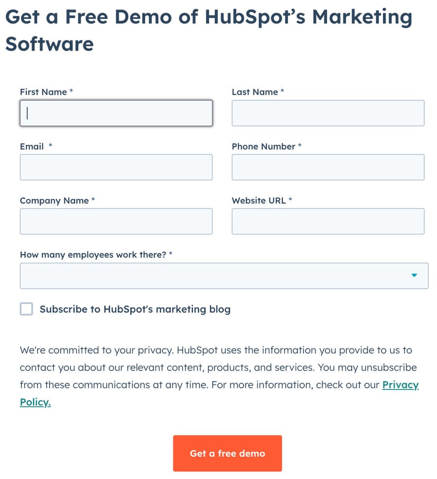
They understand their audience is predominantly small business owners who want an all-in-one solution to their marketing needs.
So, they ask for additional fields such as company name, website, and how many employees you have.
Yet, the increased number of form fields could put off potential leads and cause them to bounce.
Funnily enough, Hubspot reported that three is the magic number.
3. The Click Through Page
Next up is the click through landing page.
This page acts as the prequel to the main event — the pricing page.
It allows you to prep your potential customers before offering them a paid product or service.
Do you recall the example from Sprout Social?
To jog your memory:

Notice the landing page copy, headline, clear benefits, and optimized imagery that draws you to the CTA button:
“Start Your Free Trial.”
Plus, Sprout Social cleverly adds another feature to overcome a potential customer pain point:
“No credit card required.”
After all, how often have you decided against signing up to a free service or trial when the company asks for your precious credit card details?
Anyway, back to the click through page. It’s the perfect primer before the sales page:
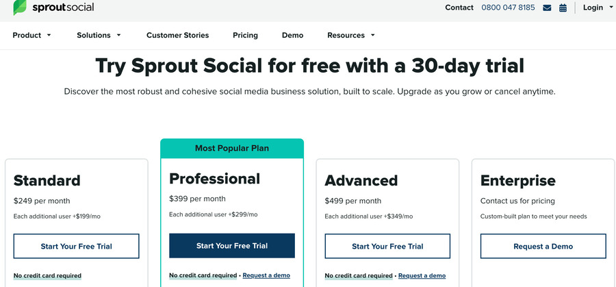
And by this point, your potential customers are briefed.
They know what they are signing up for and all the wonderful benefits they will receive. You only need to present them with the essential information and a clear CTA.
4. The Long-Form Sales Page
The long-form landing page is the bread butter for high-ticket courses or services.
Why?
Because potential customers generally need more information when it comes to making a significant purchase.
So you can leverage the long-form landing page length to inform, persuade and showcase your product or service.
Take a look at this example from OptinMonster University:
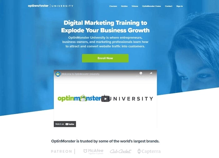
They help:
“entrepreneurs, business owners, and marketing professionals learn how to attract and convert website traffic into customers.”
It’s not cheap…
So they provide you with a lengthy description of the key benefits and use statistics, testimonials, and social proof to back up each point.
Great!
Plus, if you’re still not convinced, they sprinkle in some FAQs and a money-back guarantee to banish those customer pain points.
5. The Thank You Page
The thank you page is the final step on the conversion train.
And perhaps the most overlooked opportunity to advance a lead down the sales funnel.
So, use it as more than a means to express your gratitude and provide further value to your customers.
For example, Vital Design puts this page to work by recommending further articles once you download their ebook.
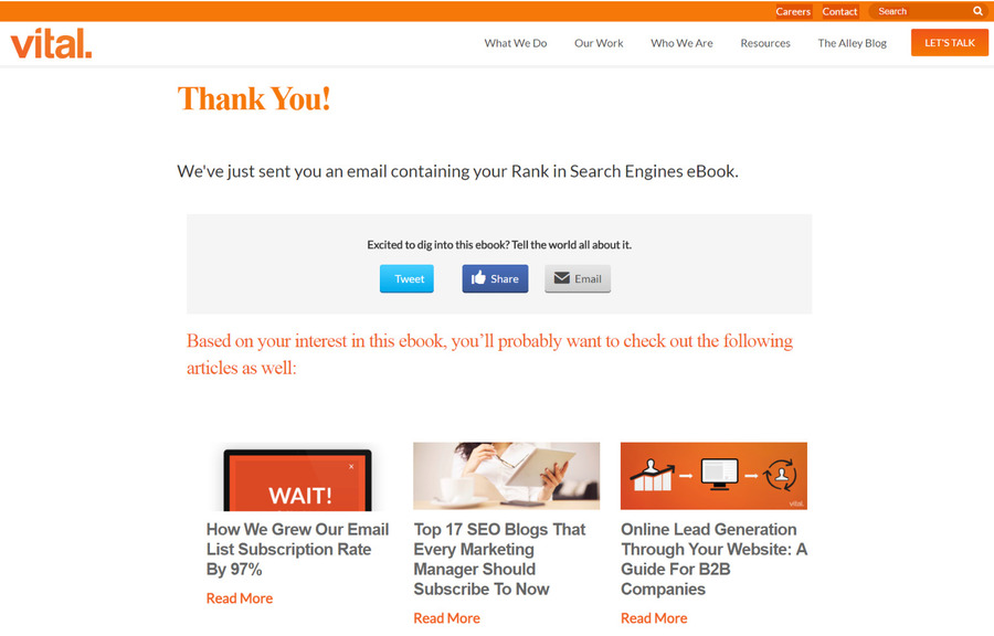
It encourages users to spend more time on your site and potentially a further purchase.
After all, repeat business is king.
Have you noticed the targeted recommendations splashed on the thank you page when you buy an item on Amazon?
Each is cleverly placed to entice you to buy additional items based on your recent purchase.
So, the key takeaway is to add value to your target audience at every opportunity to maximize your leads and sales.
6. The Unsubscribe Page
Finally, let’s explore the unsubscribe page.
It’s difficult when a past customer wants to leave.
Frankly, it hurts.
But don’t take it to heart and use this opportunity as one last hurrah to retain your customers.
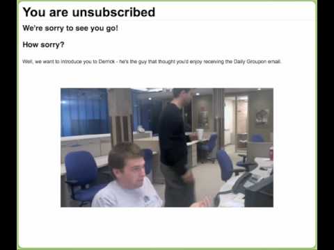
You can even take a creative, lighthearted approach as Groupon did here:
Although it’s coming up to 12 years old, it’s still gold. They cleverly integrate humor when you opt out of the daily Groupon email.
Do you “Punish Eric?”
Or make it up to him?
Yet, some just want to unsubscribe, regardless of what you put in front of them.
So don’t make it difficult.
Display a clear CTA.
After all, it’s healthy to keep on top of your email list hygiene.
7. The 404 Error Page
You’ll likely wondering:
“Why has he added an error page to this list?”
Why indeed…
Yet the 404 landing page offers a unique opportunity to seize the reader’s attention.
But first, how does it work?
If a user types the website domain correctly but misspells the URL (Uniform Resource Locator) path, they will land on “Page Not Found.”
For instance, if you’re after smartblogger.com/blog, you’ll be presented with the blog.
Perfect.
But…
If you accidentally type smartblogger.com/blpg, you’ll get the following:
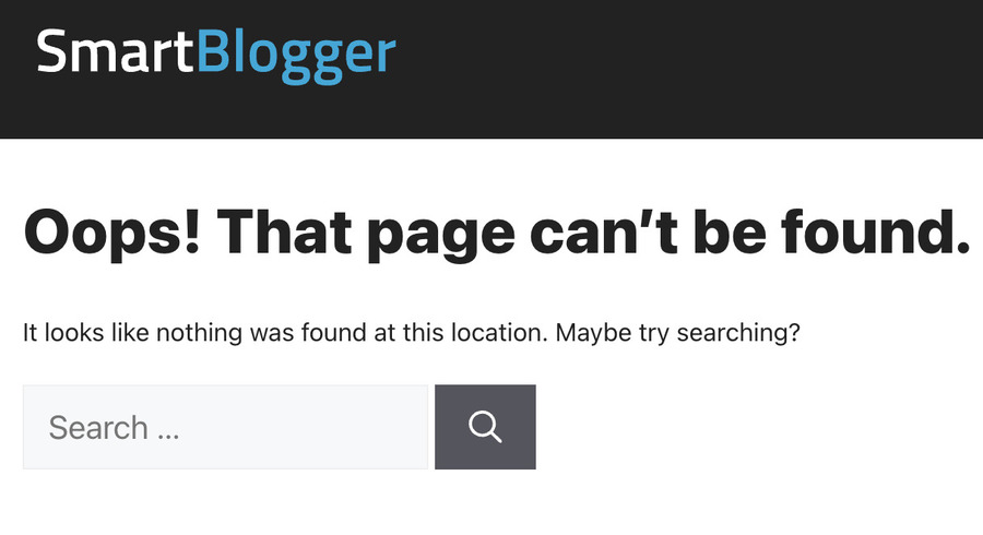
Having a 404 landing page in your arsenal can save a lost user from bouncing.
Ultimately, they know they are on the correct website.
So, all they need to do is input the original destination into the handy search box.
Bonus: The Splash Page
So, what is a splash page?
Well, it’s like the doorman before you enter a club. Asking for your ID:
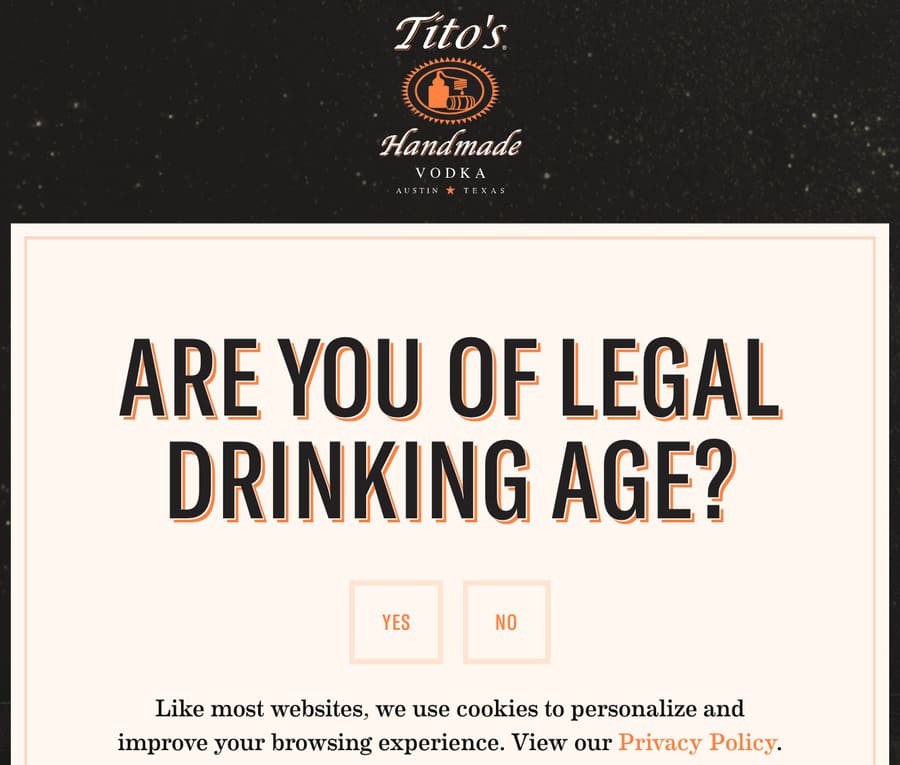
Essentially it’s an introduction to your website that can be used to segment your audience, much like the splash page above from Tito’s.
But a splash page is part of your website rather than a separate landing page.
So, why is it on this list?
Good question.
They both have a lot of similarities and goals.
A splash page can be used to promote a product, event or feature, or even snare a users contact information — much like a landing page.
Check out this example from MyProtein:
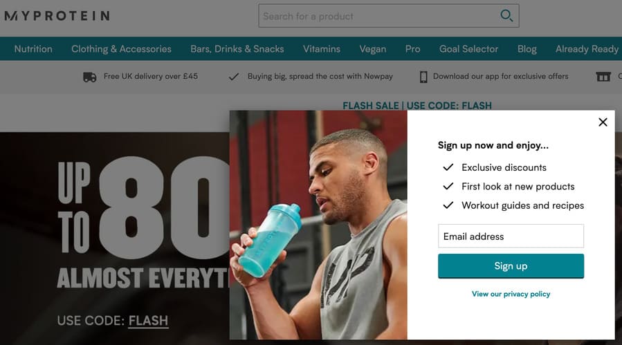
When you enter their site, you’re greeted with the above “sign up” splash page asking for your email address in exchange for a service.
It doesn’t require any action on your part, like a typical landing page.
It simply pops onto the screen and will leave once you take action.
Do you sign up? Or hit the “X” to continue to explore the website.
How to Create a Powerful Landing Page That’ll Elevate Your Leads
So you have a firm grasp of a landing page — great!
What’s next?
Well, it’s time to understand some basic steps to creating an effective landing page.
Let’s begin with the landing page builder…
Take Advantage of a Landing Page Builder
I get it.
You’re busy, and you may be considering an external source for creating a landing page.
But what if I told you there was a fast and cost-effective way for you to create a landing page.
Intrigued?
I thought so.
A landing page builder allows you to create a page without coding or technical knowledge.
Most are user-friendly and offer a drag-and-drop feature.
Plus, some even analyze and track key metrics like conversion and bounce rates.
Perfect.
Take a look for yourself and try Swipe Pages:
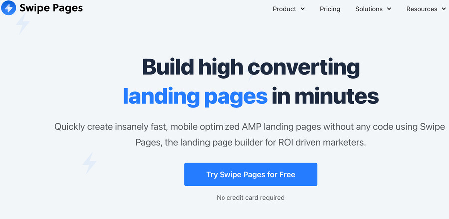
You can take advantage of Swipe Pages features and use a landing page template that’ll easily integrate into your digital platforms.
For more information, take a look at this list of top landing page builders from Smart Blogger.
Optimize Your Landing Page
You’re not done yet.
Once you’ve created your landing page, you need to ensure it’s optimized to maximize your chances of converting a visitor.
Ultimately, you don’t want all your hard work to be for nothing.
So, boost your conversions by implementing these landing page best practices:
- Unclutter your page.
- Ensure your page is optimized for mobile.
- Use a clear, benefit-driven headline.
- Create a connection with your audience by using relevant images and video.
- Concentrate on one offer per landing page.
- Use a clear CTA button.
Now, I could drill down and expand on each of these, but that’s not the purpose of this post.
Instead, check out 13+ Landing Page Optimization Tips to Hike Conversions (2024).
Track Your Metrics
You’ve created a landing page and optimized it to boost leads…
Next, track your landing page metrics and see if your actions have the desired effect on your digital marketing campaign.
Yet, which metrics should you focus on?
The most obvious is conversion rate, but Rock Content also recommends tracking:
- Number of users who leave after a single visit: Bounce rate
- Number of page views
- Average time spent on each page
- Traffic source
- Cost Per Conversion (CPC)
- The number of visitors who start filling out your form, then abandon
- Returning vs. New Visitors
Each work in unison to give you the “big picture.”
So, open Google Analytics and ask yourself…
Is your landing page performing?
If not, it’s time to start experimenting with AB testing.
Never Stop A to B Testing
First up, you’re likely wondering:
What is AB testing?
Good question.
AB or split testing is the act of testing one variation against another.
You could do this sequentially, but why not save time and conduct the test simultaneously?
For instance, you could create two different CTA’s, split your traffic and see which is superior.
But don’t go overboard.
Tweak one variable at a time.
If you decide to test two different CTA’s and headline variations, how would you know which inspired the increase in your conversion rate?
So, start small, tweak, then rinse and repeat — it’s a never-ending battle that will garner results!
Are You Ready to Take Action & Start Building Your Landing Page?
You’ve made it!
Let it all sink in, take a deep breath and prepare yourself.
Because it’s time…
Time to take action and implement the skills you’ve learned today.
After all, you’ve advanced from a landing page newbie to a grand master.
So, pull up your socks, take inspiration from this post, and start creating your high converting landing page.
You’ll thank me later.
